I collaborated with Ashley Sanford to design a logo for her voice studio, Ms. Ashley Sings. The goal was to design a logo that conveyed a sense of growth, expansion, and warmth. The client suggested specific colors as a starting point.
The challenge for this project was to create something memorable and trustworthy, that also conveyed a sense of creativity, playfulness, and space to explore self-expression. Below are a few initial sketches that used movement and texture to communicate this.


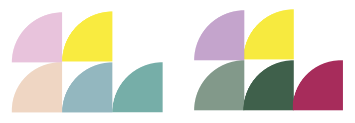
I wanted to convey the sense of strength and safety that Ashley embodies when working with her clients so I explored soft, comforting color combinations to help support that.
Other concepts explored but ultimately not used were piano keys as stairs to represent growth, and overlapping circles to represent support and community.


I also explored geometric styles that were ultimately not used.

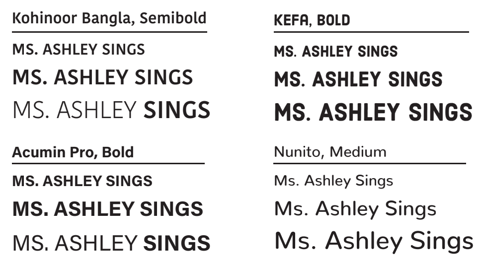
I selected bold, modern typography, avoiding serif and script fonts that might feel too formal.
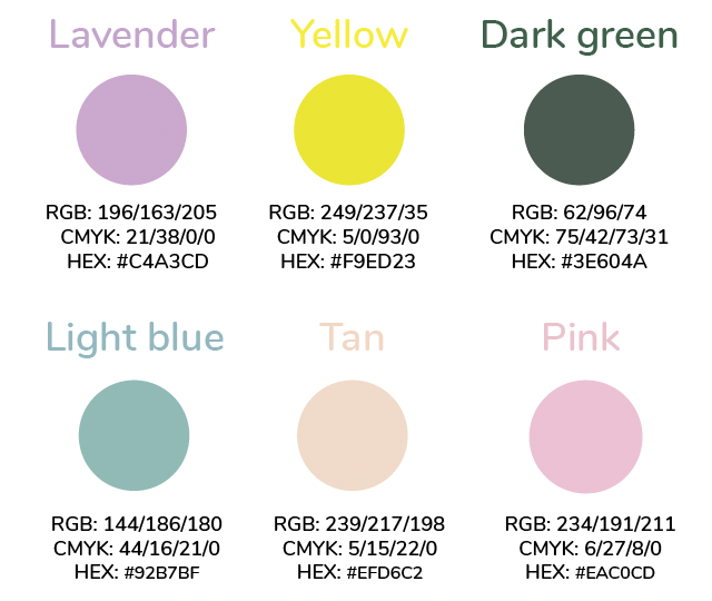
FINAL COLORS AND TYPOGRAPHY

Headings and Body Text
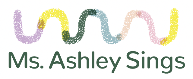
FINAL LOGO AND VARIATIONS
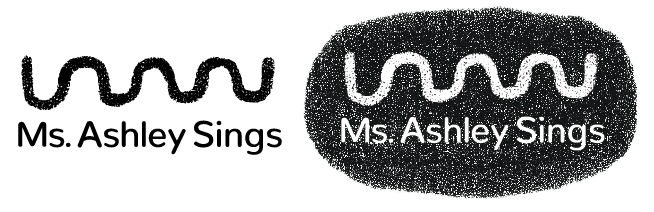
The hand drawn, wavy line communicates movement, playfulness, self-confidence and self-expression. The colors embody a sense of calm and creativity.
Primary logo

Logo Mark for use as needed where the full logo cannot be used for design or space constraints.