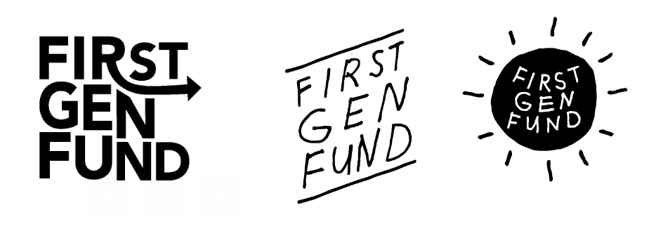
My initial sketches included concepts that explored forward momentum and positivity.
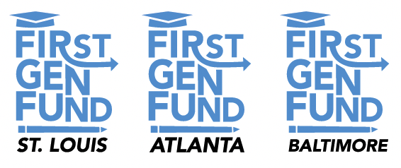
The client requested I work with the color blue.
FINAL LOGO
The client preferred the bold text and arrow representing progress and growth so we worked together to refine the that concept. I added graphic elements to make the purpose of the fund more clear.
I also included examples of how this logo could be adapted if this scholarship fund expanded to different cities.